USA TODAY NETWORK Native App Navigation

Our product team wanted to improve discoverability of our iOS and Android apps for the USA TODAY NETWORK by rethinking the navigation experience. We wanted to modernize the user interface while adding helpful features. After release, the app received the highest amount of positive reviews with increased engagement.

Roles

UX & Design Lead - worked with 1 UX Architect, 1 Product Manager, 1 Project Manager, 2 Developer Managers, 2 iOS developers and 2 Android developers

Tools

Sketch, Invision, Framer, Usertesting.com

Platforms

iOS, Android

Skill Development

Userflows, iOS and Android design and human experience standards, bottom navigation best practices, gesture requirements, user testing, search functionality and discoverability
usat-nav-hero-image

Problem

Feedback from app store reviews, emails and usability testings told us our users were having difficulty finding things they wanted in our app. From analytics, 90% of our readers were staying on our default ‘Top Stories’ screen, while the other 10% of users were navigating into other screens. This data illustrated to the team that discoverability needed to be addressed.

Approach

To optimize discoverability, the team focused on the navigation structure. The app originally launched with a ‘hamburger menu’, which we wanted to replace with an exposed bottom navigation. We would conduct competitor analysis and usability testing to ensure our new navigation would serve the needs of our readers. In addition, there would be multiple rollouts with new features to improve discoverability.


Userflow

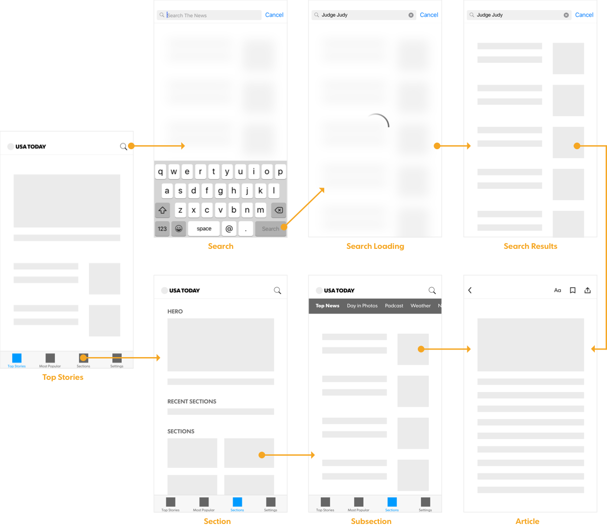
Userflows were created and discussed with the team before moving into designs. This helped us work with devs to ensure what would be built was feasible. User interactions were written in our requirements document.

usat-user-flow

User Testing

A bottom navigation has never been implemented. We went through multiple rounds of user testing and designs to meet specific criteria. Our final round of user testing benchmarks satisfied our team to move forward:

Bottom Navigation Design

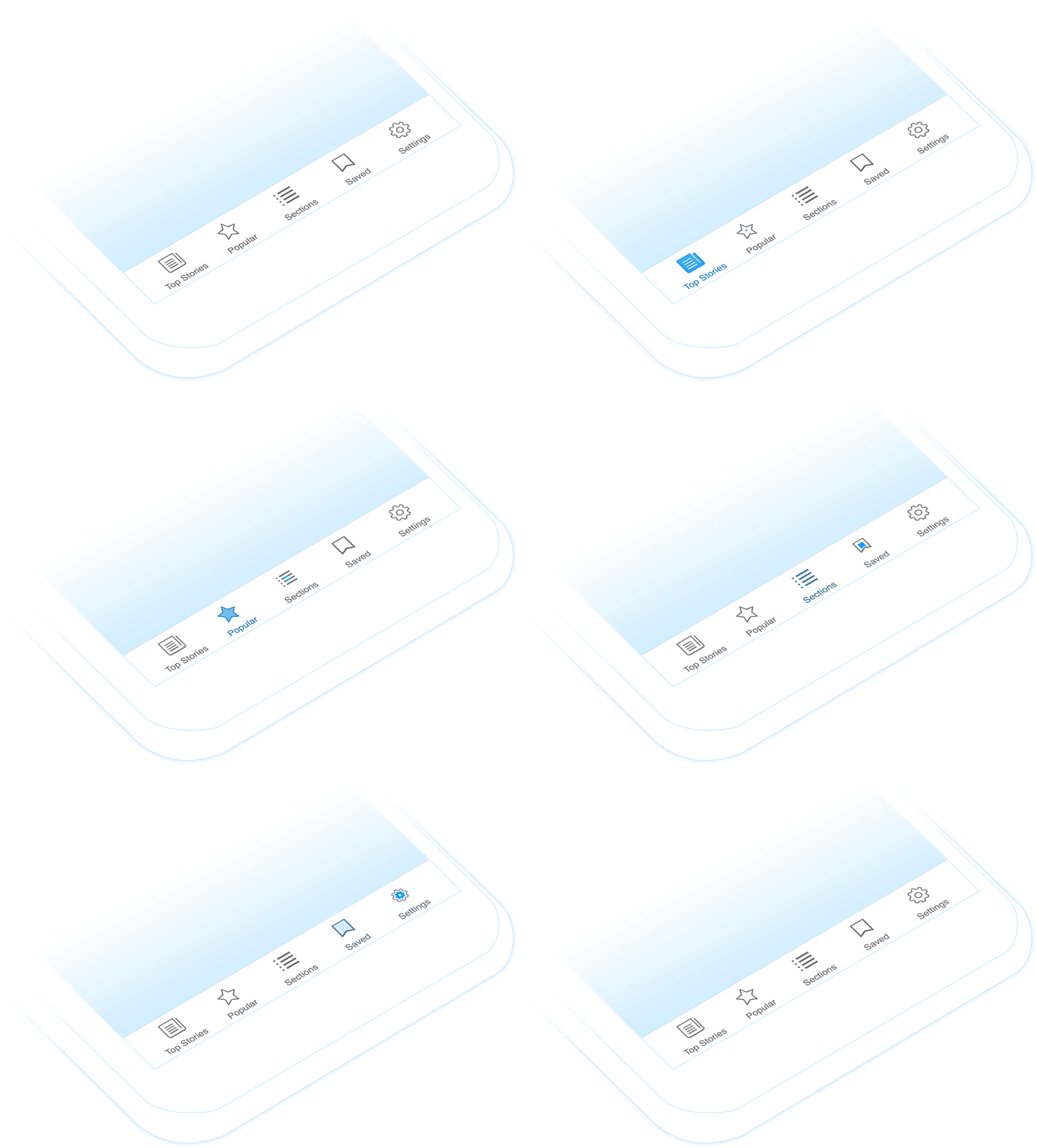
Our exposed tab bar navigation showcased the breadth of our content and made it easier to navigate around the app. Moving away from the ‘hamburger menu’, we eliminated a number of steps and created a more seamless experience.

usat-bottom-navigation

Animation & Documentation

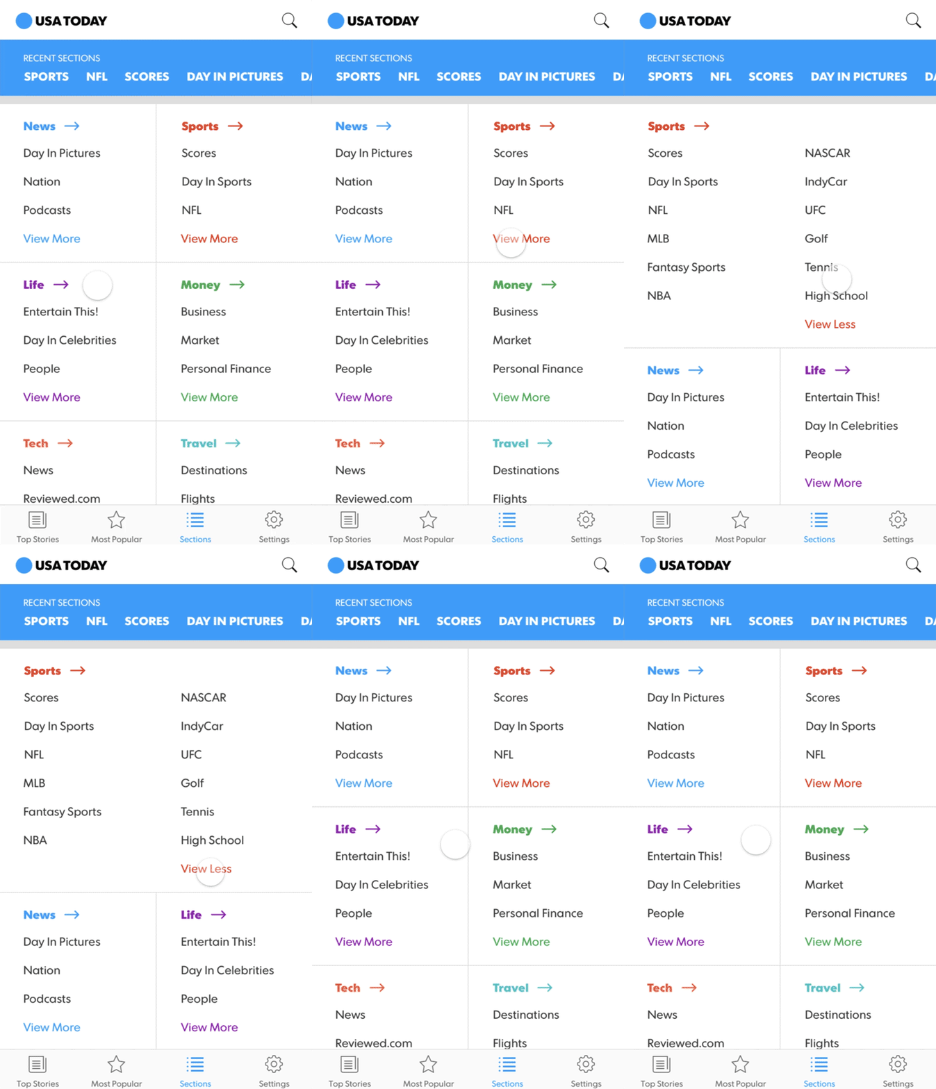
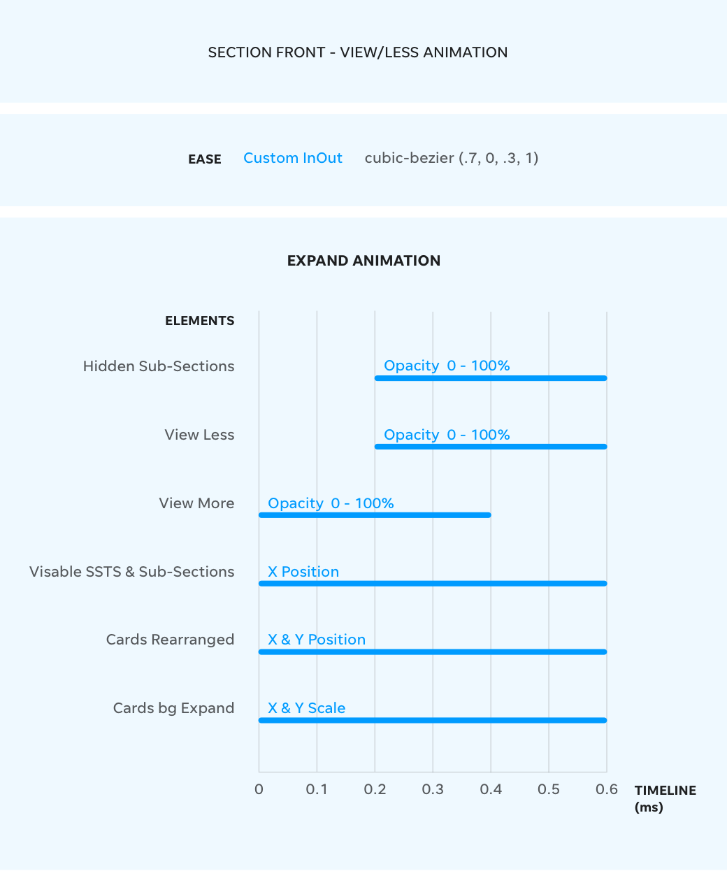
Prototypes were used for user testing and illustrated animations for the development team. The expand / collapse animation was carefully thought out to create a pleasant interaction. This was the first and start to document motion in a style guide for our products.

Sections

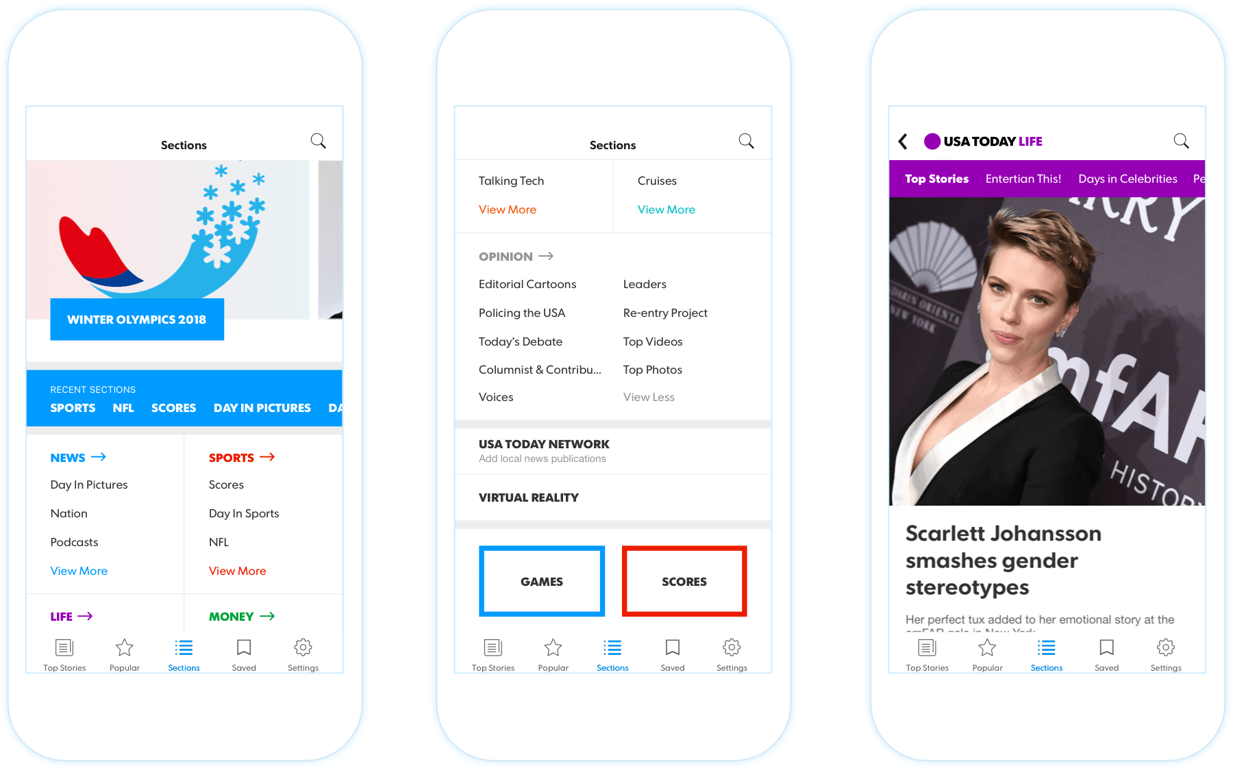
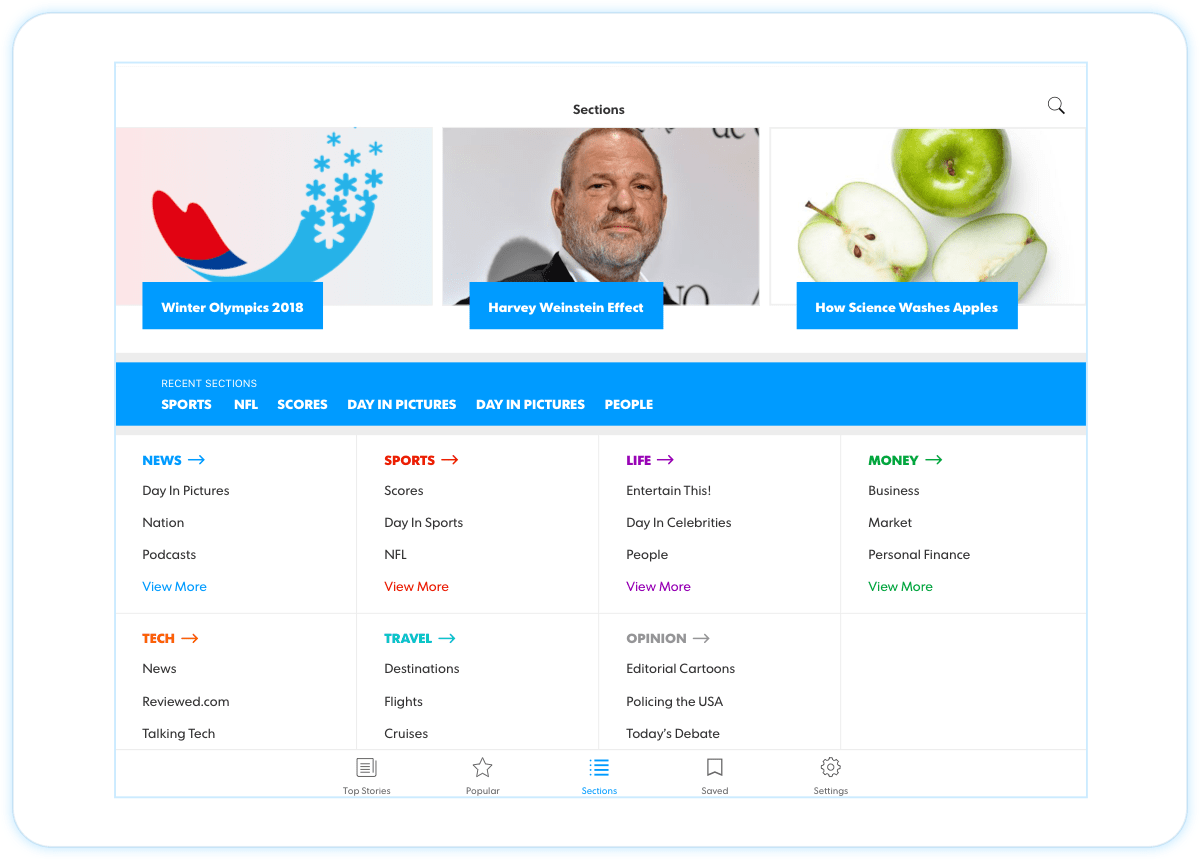
Our main news sections are more visually engaging with better hierarchy. The sub-sections are a swipe-able ribbon. The hero helps surface high priority topics. A ‘recent sections’ feature allows users to easily visit their frequent sections.

usat-nav-sections
usat-bottom-navigation

Top News, Most Popular & Search

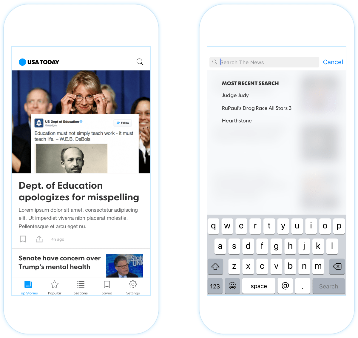
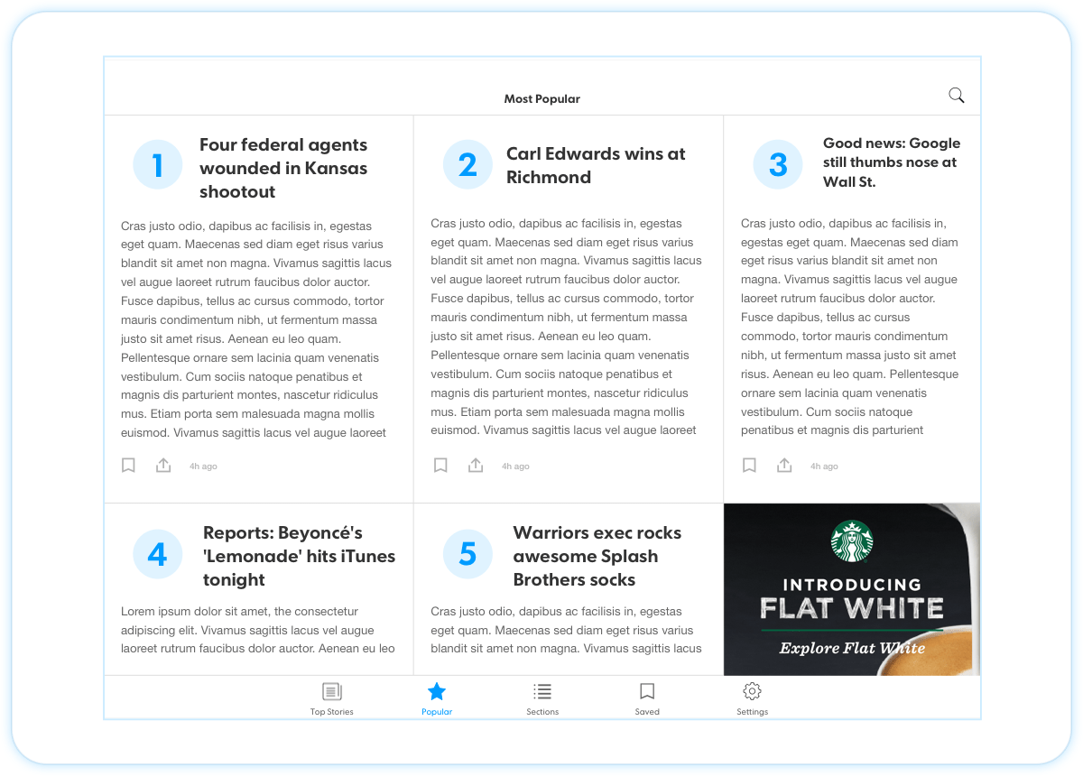
These three screens were new to our users with added functionalities. We updated the UI to make the brand feel more cohesive and added search that remained native to their respective OS.

usat-nav-sections usat-nav-sections

Reviews

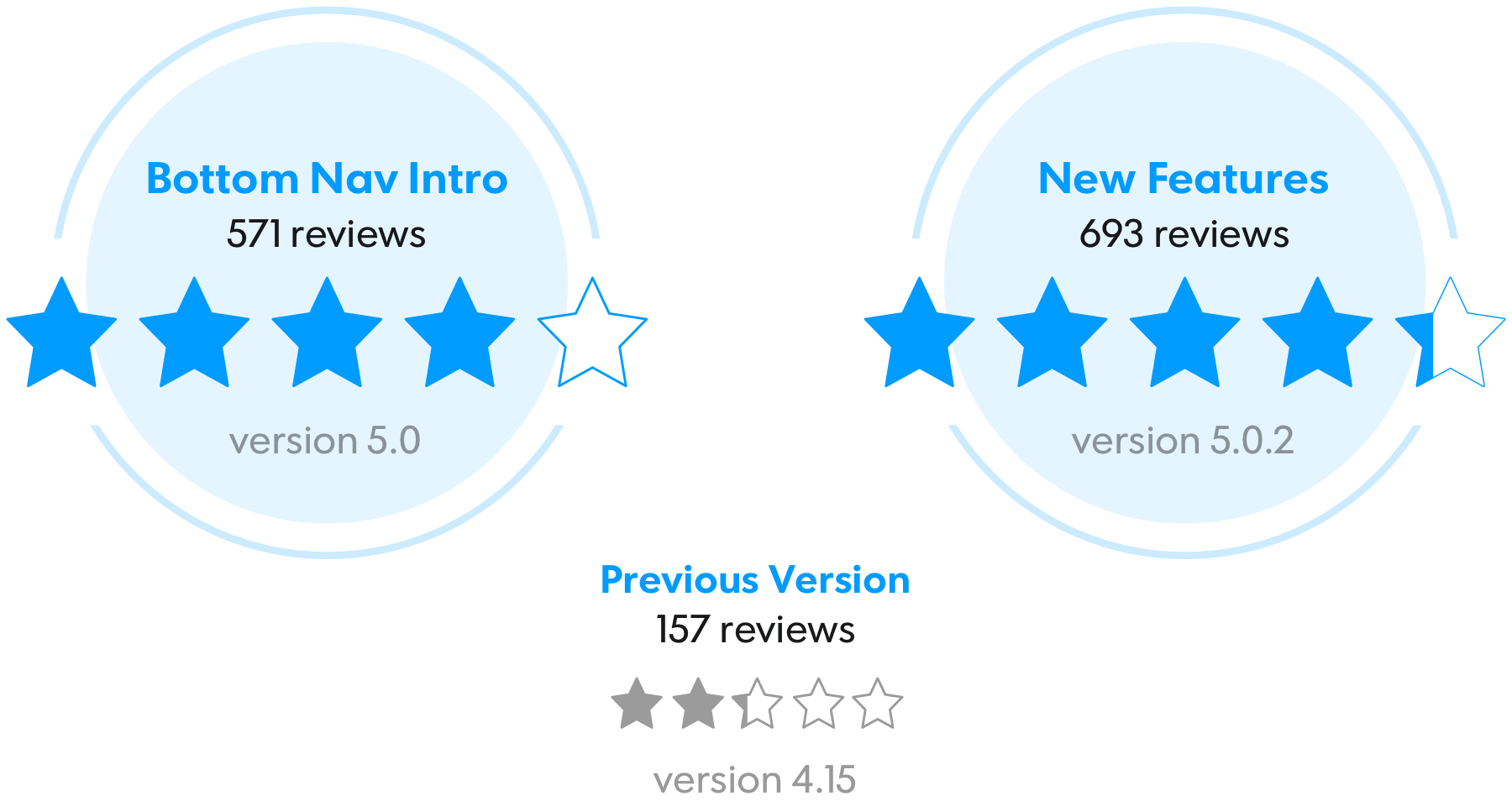
After the release, we saw a significant sentiment rebound and change from a downward rating trend since the last 4 updates. Nearly 84% reviews had an assertively positive tone, this is the highest it has been since the last 7 updates. An increased app ranking in News & Magazine category to number 5.

usat-nav-reviews

Engagement

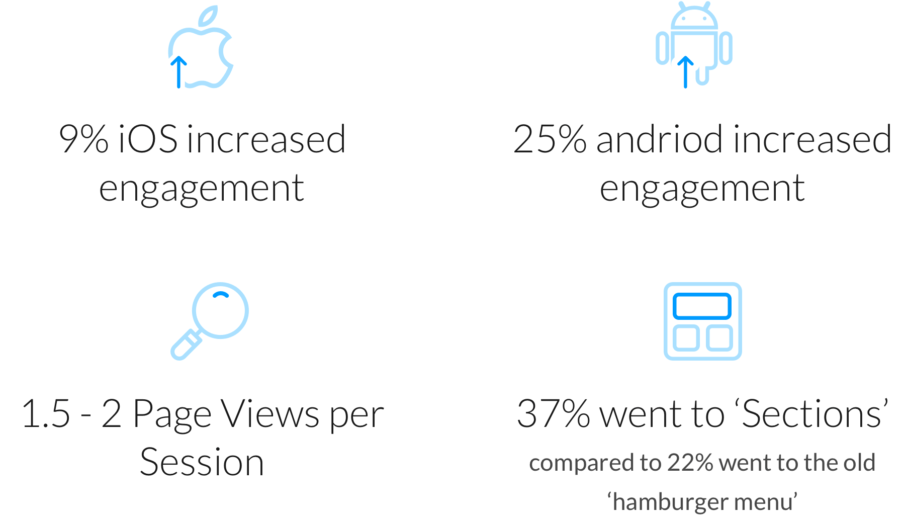
Overall engagement has increased on iOS and Android.

usat-nav-engagement