USA TODAY Redesign 2017

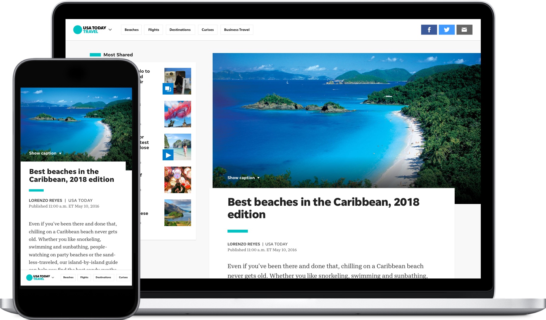
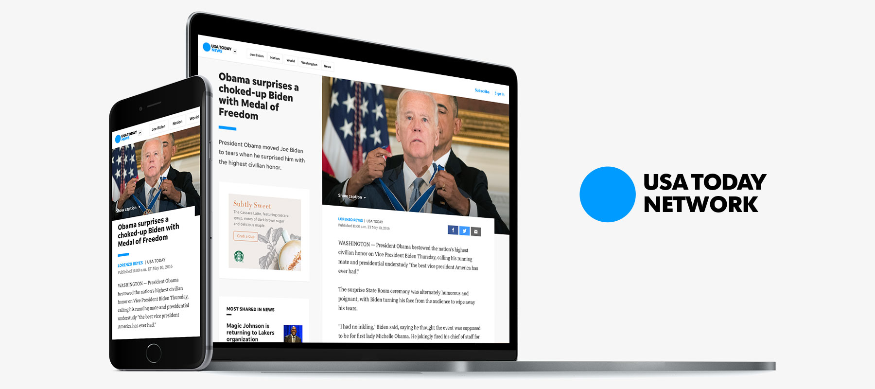
A complete overhaul of the entire suite of USA TODAY digital products lead by our in-house product team. The project was a tremendous collaboration with numerous departments, stakeholders and our users. The product team wanted to build a large-scale system that unified the experience for our 14 million daily users as well as improving our internal workflow. Throughout the year, the product team grew to love reusable and reiterative module design.

Roles

Designer & Animator - worked with our product department that include teams of devs, product/ project managers and designers

Tools

Sketch, Photoshop, Framer, InVision, usertesting.com

Platforms

Responsive web

Skill Development

Grid system, module design, wireframes, responsive type, storytelling creation, advertisement improvements, animation standards, documentation, competitive analysis, style audits, brainstorming sessions, media asset management
usat-redesign-hero-image

Problem

USA TODAY’s main objective is to inform the community of newsworthy events. However, there were multiple issues our 4000 journalist encountered when producing their stories - the content creation process. Our creation system was inflexible to produce unique stores across the Nation. This issue caused frustration to our journalists and hurt the value of their story telling.

Our user experience was extremely inconsistent. There were multiple variations on each platform, which included different elements, promos, type, styles and code. This produced a broken experience for our readers, confusion for the newsroom and heartache for the design/dev teams as styles were not managed appropriately.

Approach

The team wanted to reimagine the entire site to be hyper flexible, empower our content creators and deliver a best-in-class user experience to our readers. We started by embedding ourselves within the newsroom, created an audit of legacy styles, researched our user needs and analyzed competitors. From understanding our past, we could move forward with a better user experience.

We started to design from the ground up focusing on basic design principles: grid, type, colors and styles. We worked closely with the developer team to understand their language to help build a streamlined system and documentation. Our goals was to create a simple unified user experience using clean design while streamlining our internal process.


Legacy Audit

Over many years, our designs vired off into multiple directions. To understand our current problems, we took inventory of our entire site to analyze our design evolution.

usat-user-flow

Reusability

With inconsistent and inefficient designs, this hurt our ability to iterate and innovate. We realized our key factor for the redesign had to be reusability.

usat-user-flow

Grid System

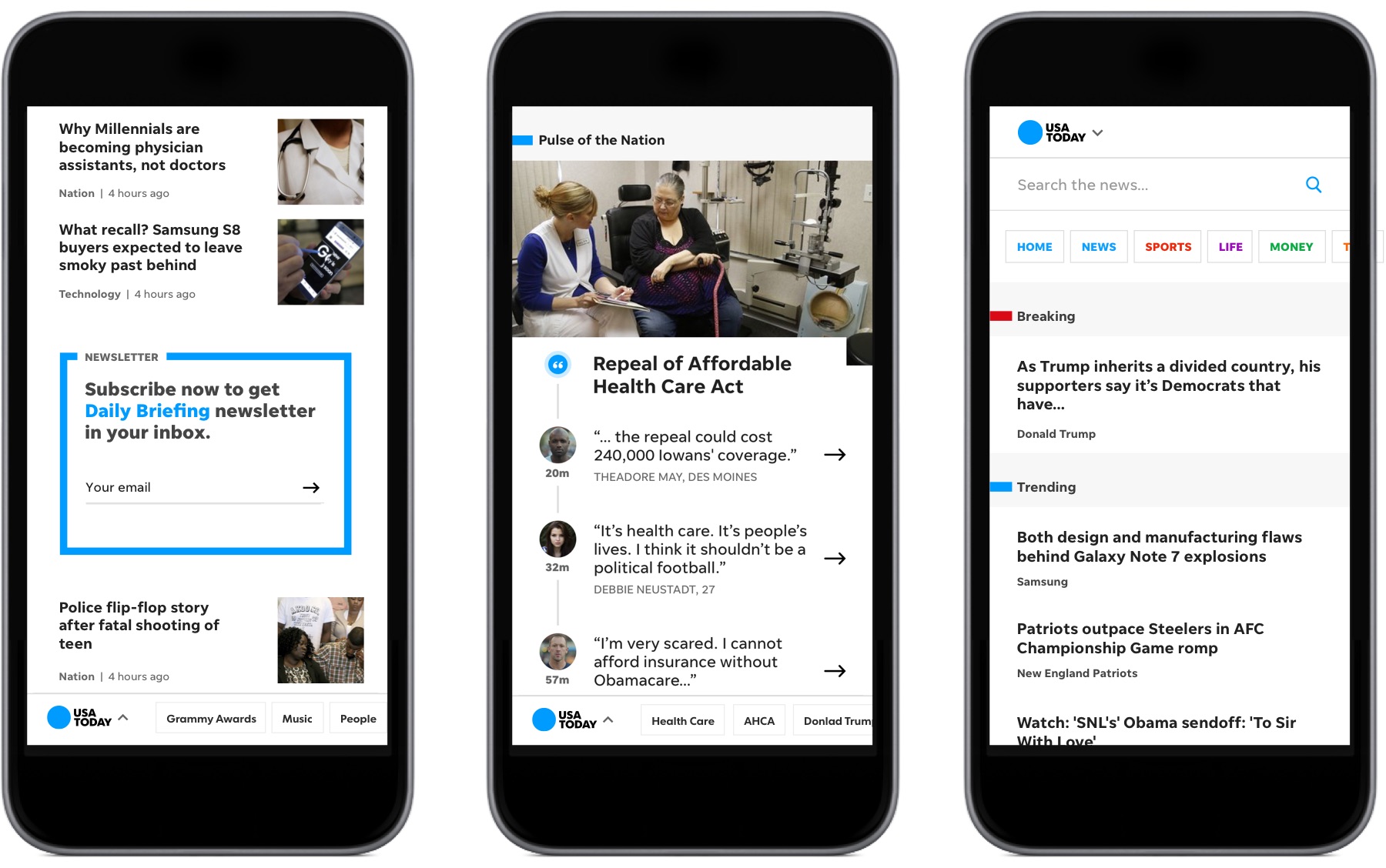
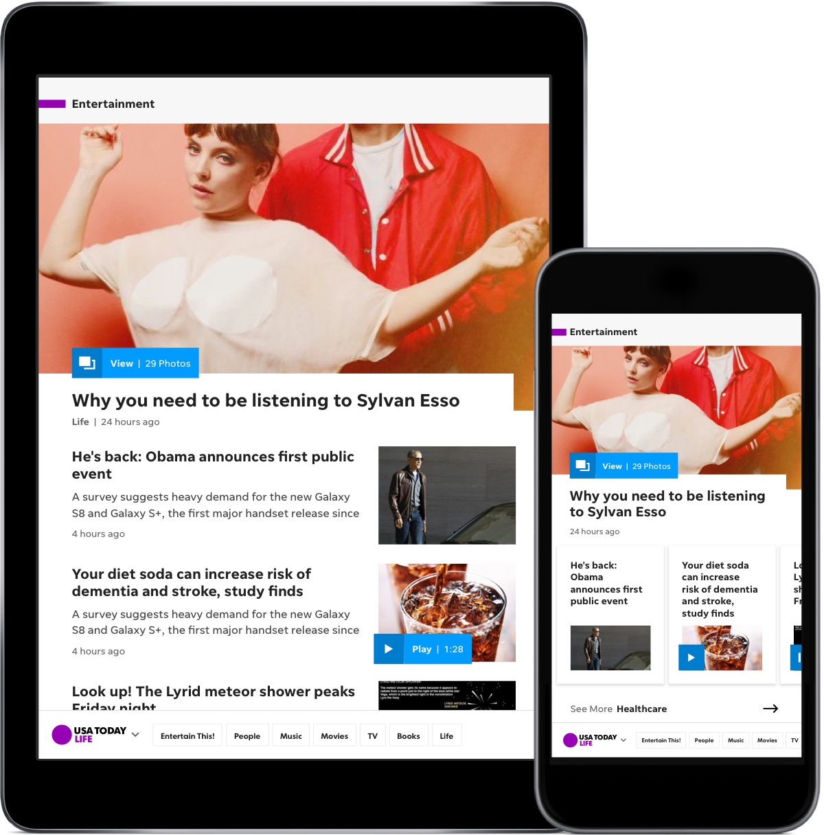
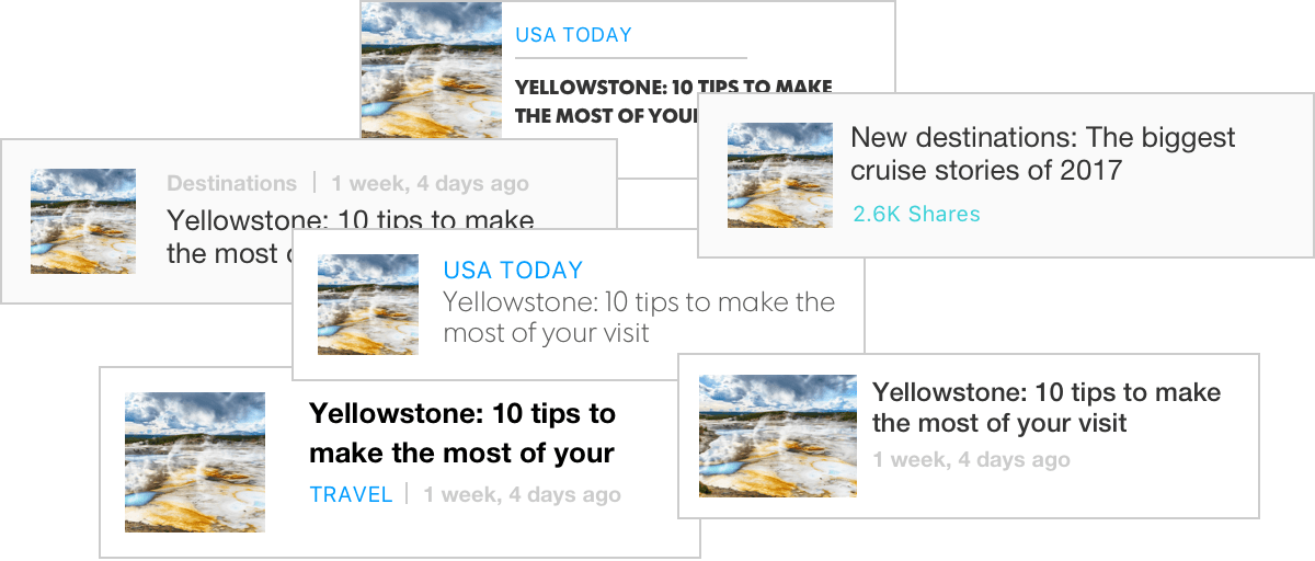
Our redesigned site is built on a flexible percentage based 12-column grid with sub grids to allow for an atomic module system.

usat-bottom-navigation

Type Ramp

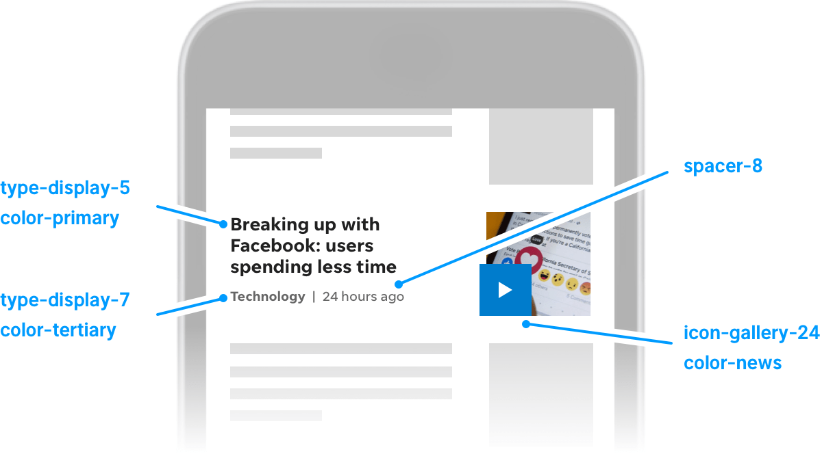
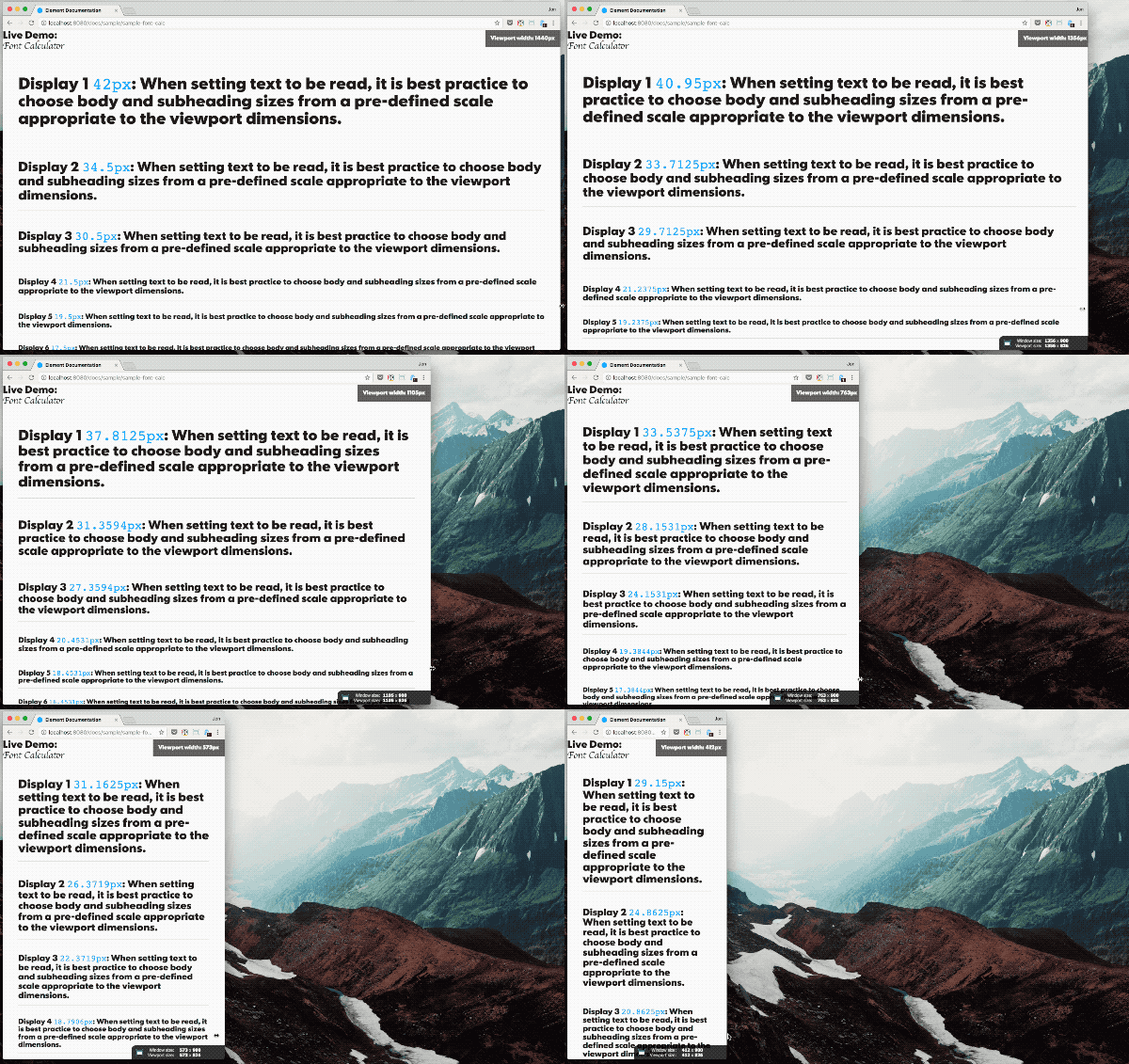
To maintain type hierarchy efficiently, a scaling system was thought out that eliminated fix type using a mathematical equation. To achieve optimal balance of design flexibility, we identified six core type properties as guidelines.

usat-bottom-navigation

Documentation

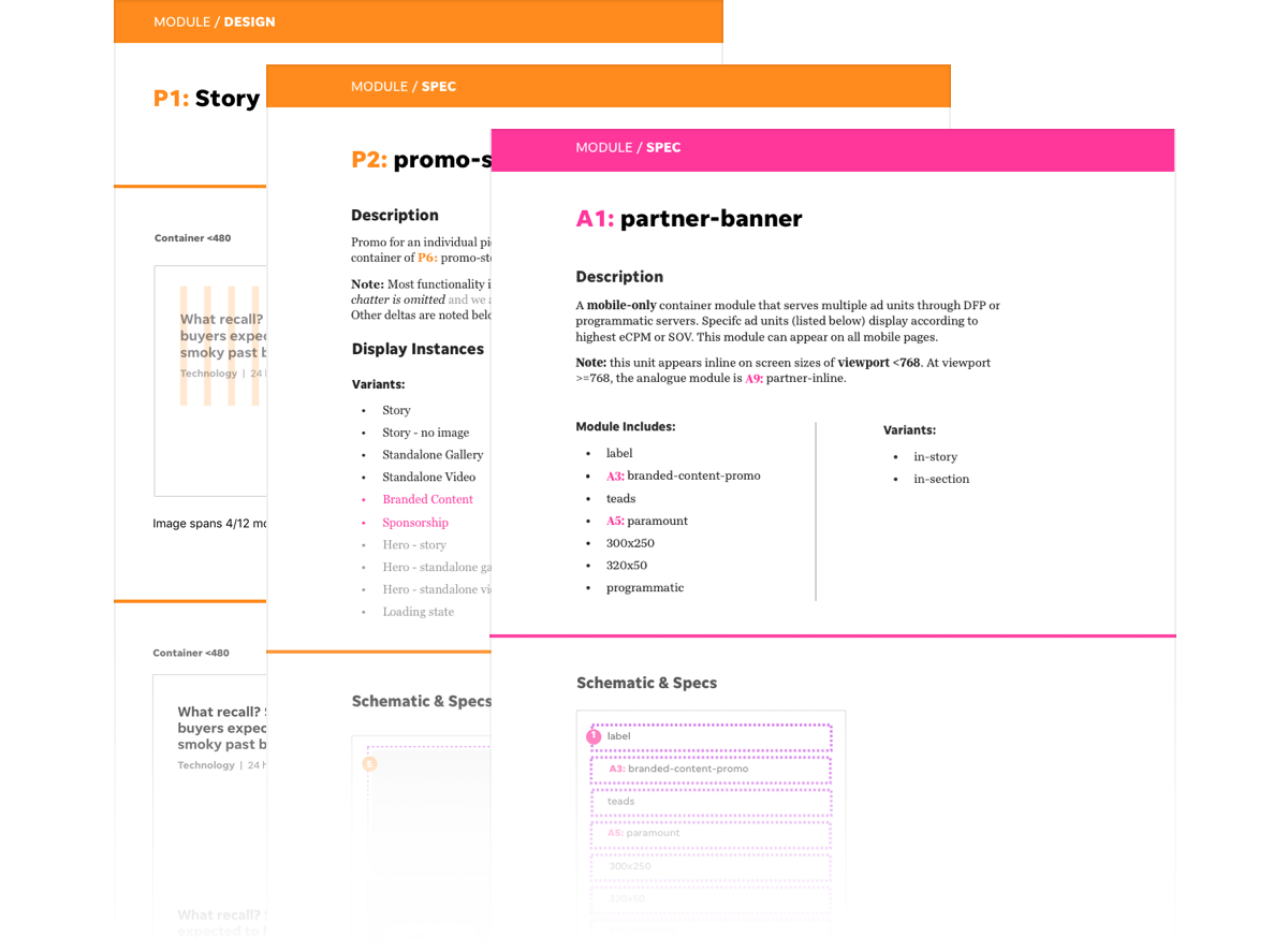
Streamlined language within our teams was essential to create usable documentation. The documents outlined styles and functionalities of our templates and modules.

usat-nav-reviews

Design Mocks

usat-nav-reviews usat-nav-reviews
usat-nav-reviews

USA TODAY Redesign 2017 - Advertisements

Roles

Lead UX/UI Designer - worked with 3 product managers, 1 project manager, 1 Sales VP and 2 developers

Tools

Sketch, Photoshop, InVision

Platforms

Responsive web

Skill Development

Grid system, wireframes, component-based design, competitive analysis, management system, data & reporting visuals, responsive ad products, branded content design & standards

usat-redesign-hero-image

Problem

Our advertising experience was affecting our user negatively. Market research illustrated USA TODAY ranked poorly against competitors for because of intrusive ads. We had multiple pop-up units along with unbalanced ad-to-content ratio. There was a lack of smart ad logic that provided poor targeting and page reflow. Branded content was an upcoming industry standard and not being utilized effectively on our site.

Approach

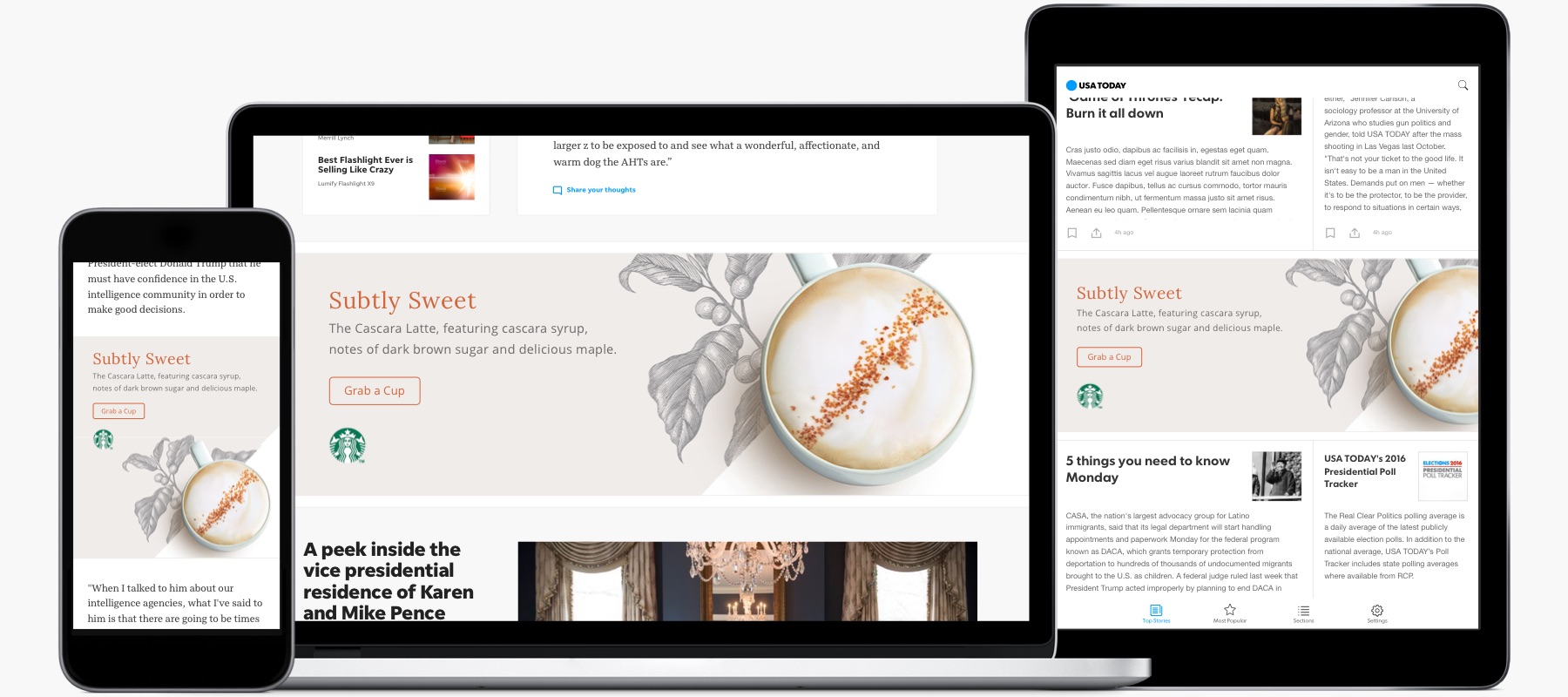
We needed to move away from intrusive ads and create a more seamless experience that worked with the layout of our content. In order to do this, we created a new cross-platform custom ad unit and smarter ad logic without jeopardizing important industry metrics. We focused on improving the branded content strategy by streamlining design and building flexible promotion modules.


Paramount

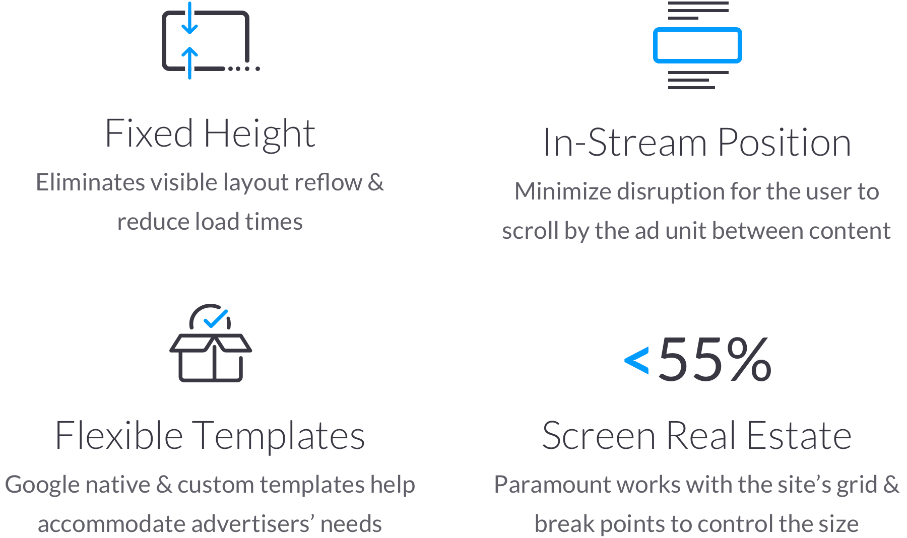
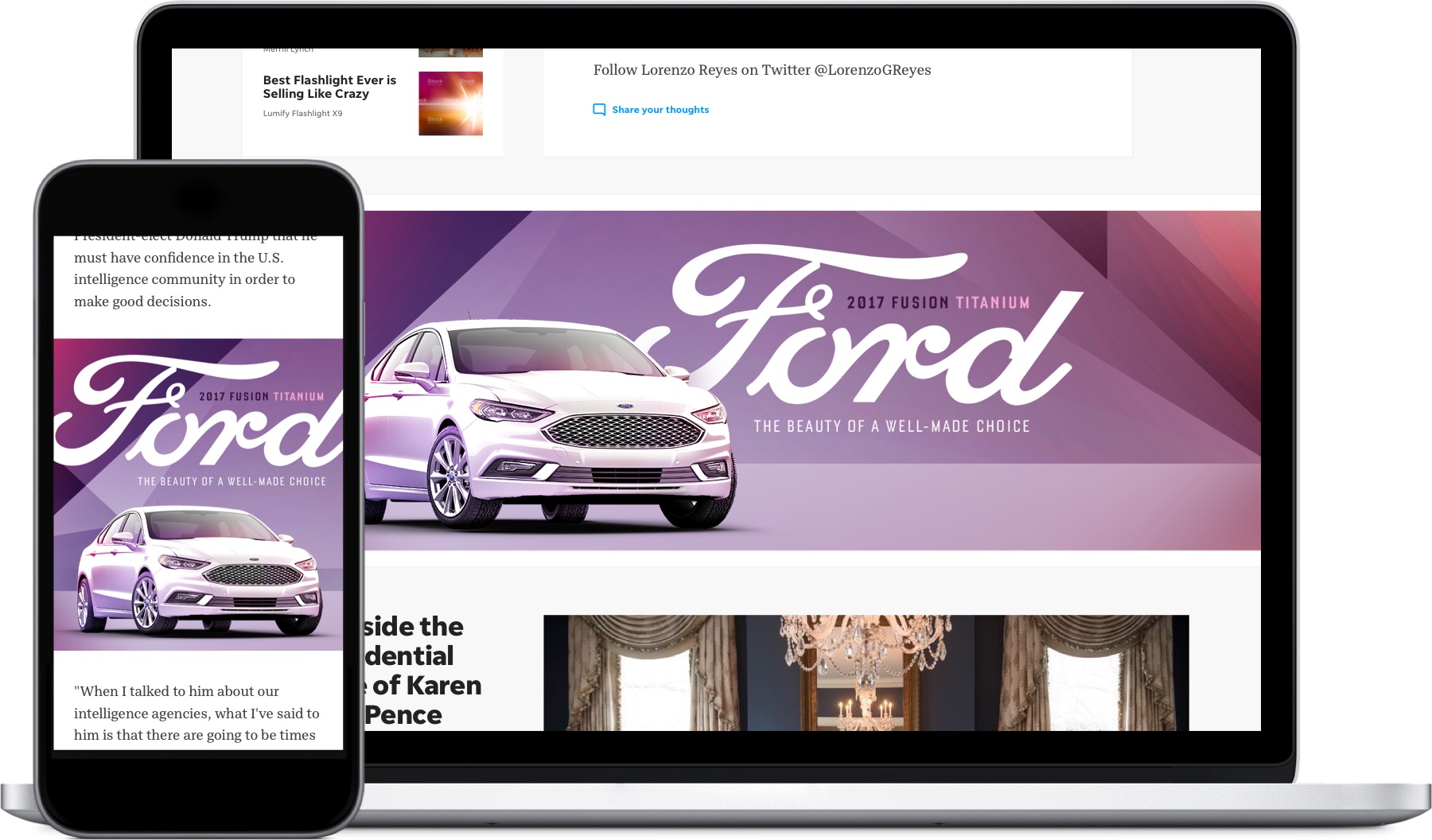
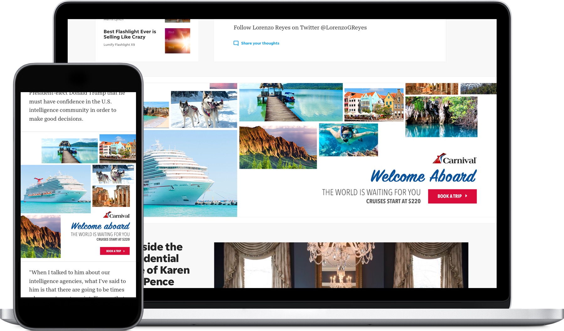
Paramount is the new responsive custom ad unit for USA TODAY and our 100+ publishers that utlize the redesign framework grid. The focus was to create a product that improved the overall ad experience while appealing to advertisers.

usat-user-flow
usat-nav-reviews usat-nav-reviews

Smarter Ad Logic

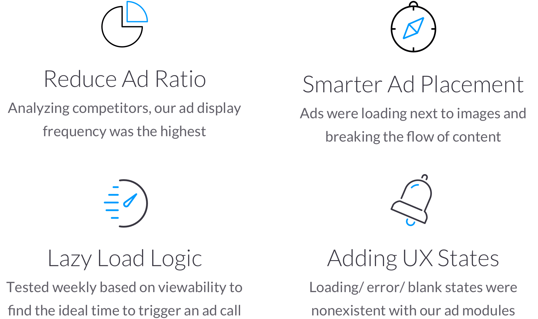
Below are the ad requirements that were re-evaluated and improved during the redesign to avoid negatively impacting the user experience.

usat-user-flow

Branded Content

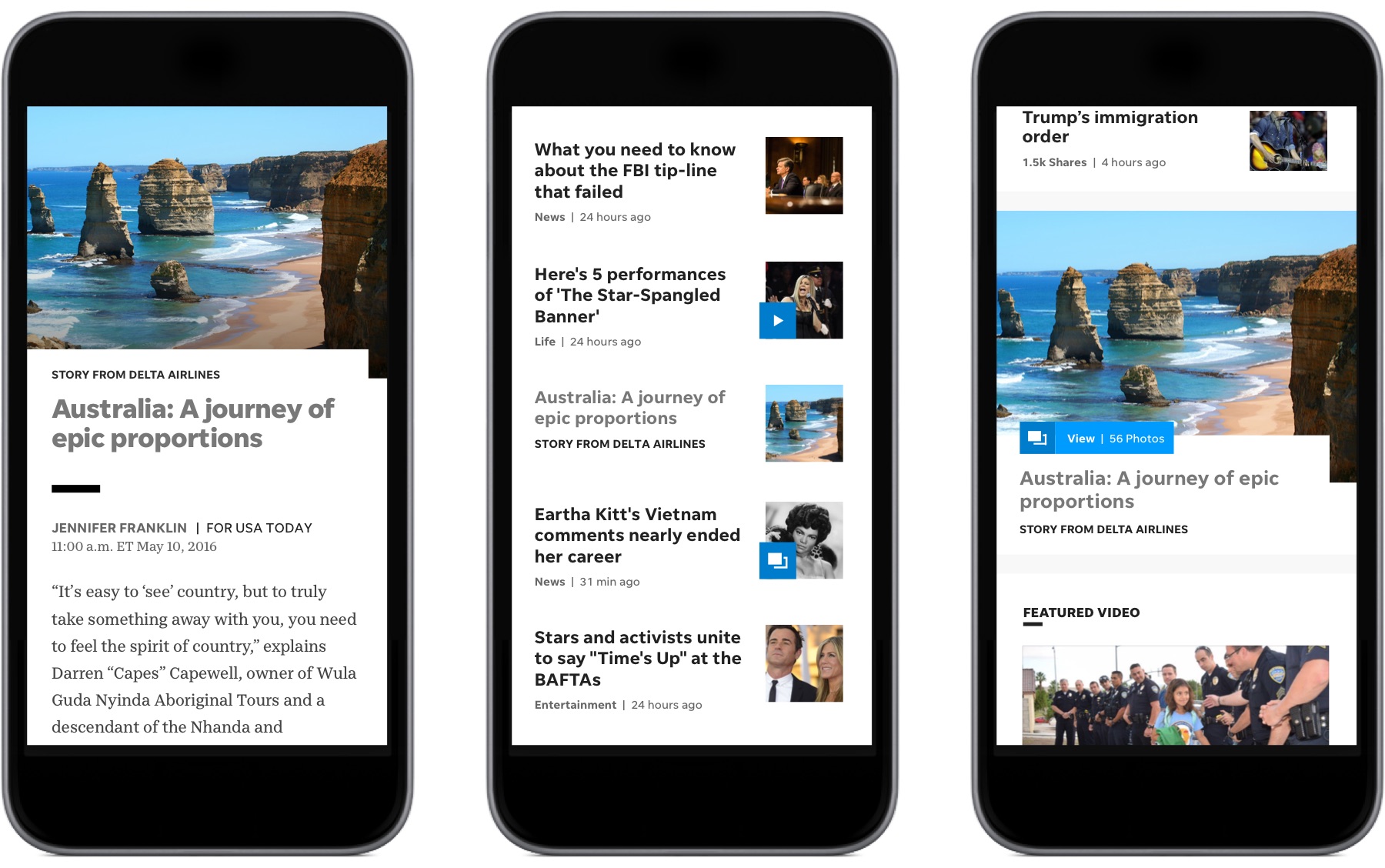
A holistic approach between editorial and branded content was thought out during the redesign. Modules and story templates were flexible to incorporate branded content. For the design, a unique reverse style was applied to branded content to differentiate from editorial.

usat-user-flow

Alexander

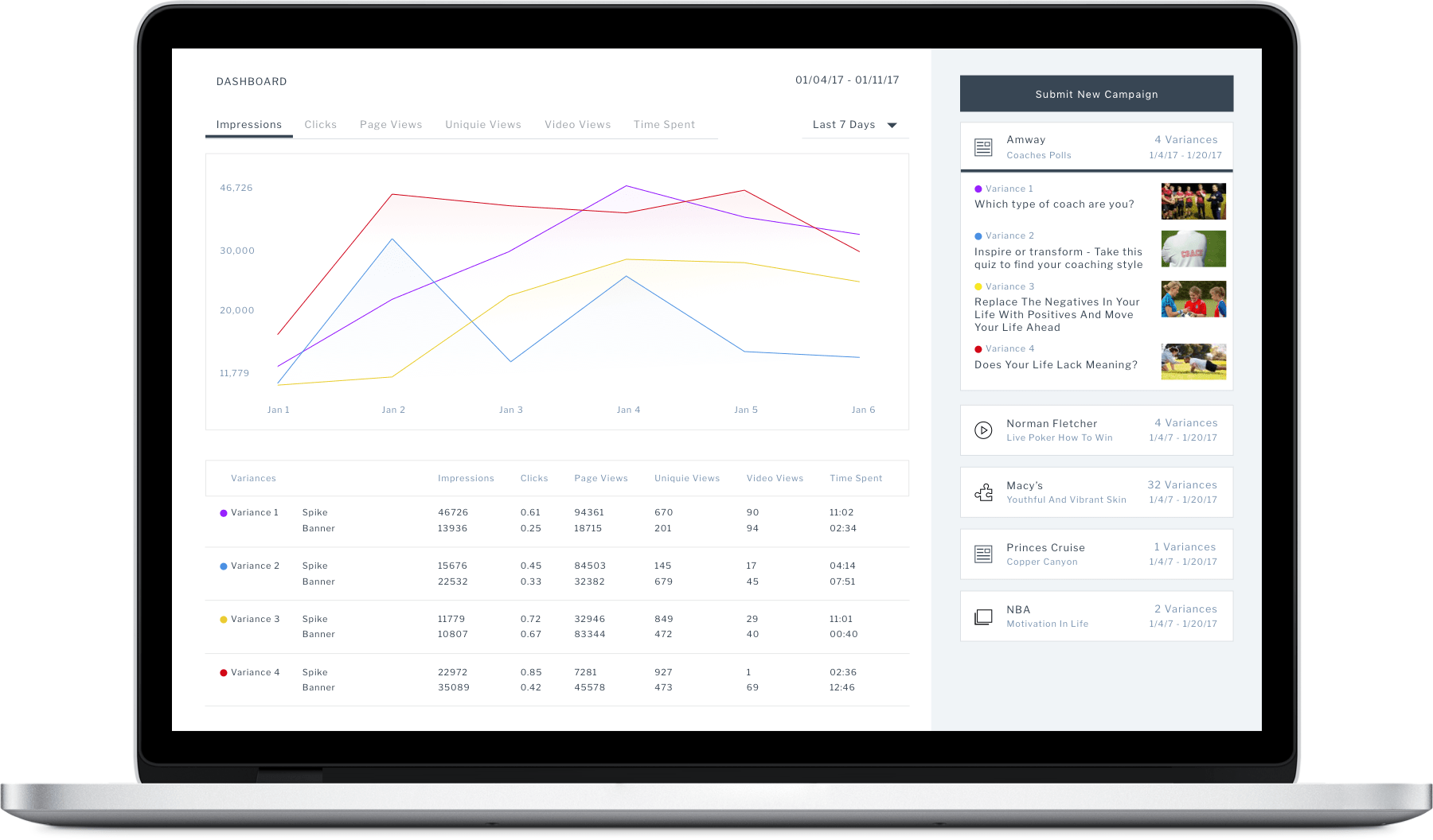
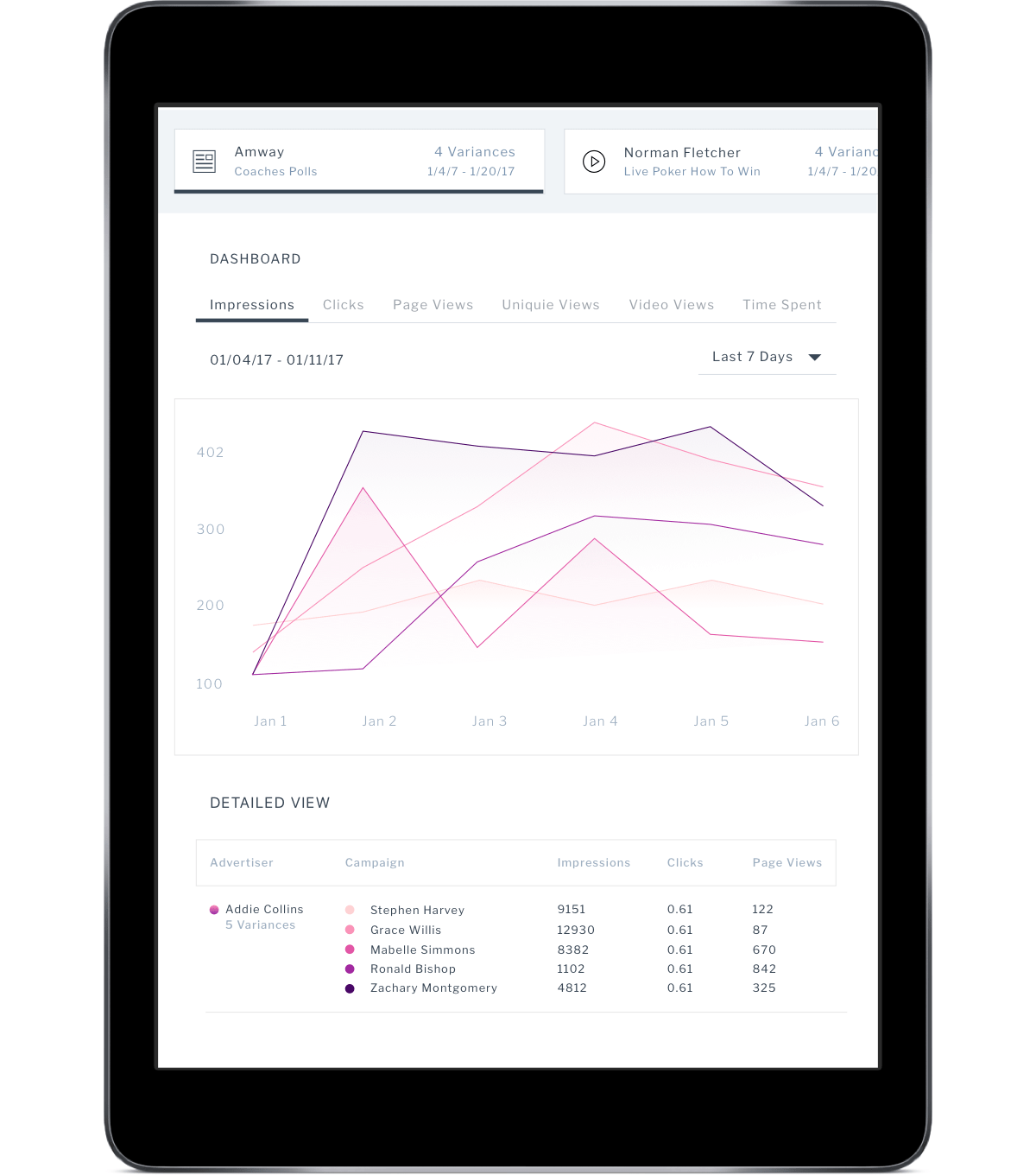
An in-house management and reporting system for branded content campaigns. The system synced with google DFP to allow easy scheduling and publishing.

usat-user-flow
usat-user-flow
usat-user-flow